Sunday, February 28, 2016

Vector Illustration

I couldn't do it. I can't be any more blunt. This was one of the most agitating projects that I have ever done in all my time in school. I understand what I am supposed to do. I just can't do it. Its confusing, time consuming, trial and error, but most of all, it isn't fun. I had fun doing the other assignments. I had no fun doing this. I understand that assignments aren't meant to be fun. They are meant to be learning experiences. At the same time, there is only so much frustration one can take before you just give up. Besides, I've never been good at 3D art anywhere.

I'm sorry. I know I'm better than this. Again, I just couldn't do it.

With all that out of the way, I guess I should explain what I was attempting to do.

Obviously, I tried to create a vector illustration of  a soda bottle, specifically a Coca-Cola bottle. For reference, here is the picture I based my illustration off of.


Obviously, I had to exclude the brand, per your requirements for this assignment. I tried to do a face, but I had more frustration with that. I played around with other things, like buildings. These were even more complex, though. I picked a soda bottle because I thought it would be simple enough for me to handle.


There is supposed to be a black text behind the white one to give off the illusion of 3D. I don't know what went wrong with the conversion.


Wednesday, February 17, 2016

Character Project

I really had no idea what I was doing. I just picked colors that made at least some sense. I want to clarify a few things that I think might be confusing.

The black ears are not the same as the rest of the fur because I had trouble creating something that was aesthetically pleasing with the same color. If I didn't use an outline color it blended into the ear too much and if I did use a outline color, it just looked out of place.

The blue blob in the center of the spider legs is supposed to be a globe. However, I quickly realized as I was working on this that that was not going to be possible. I don't have the skills to do it yet. On a side note, the spider legs remind me of Pokey from Earthbound.

The two shades of blue are supposed to be a skirt. Emphasis on the word "supposed".

The message "Link Joker was here..." won't make any sense unless you play Vanguard.

Wednesday, February 10, 2016

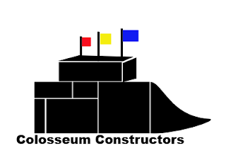
Final Logo


Explaining the logo:

1. I chose to go with using individual blocks to form the logo for two reasons. First, I had difficulty creating a logo that would depict a 3D stadium. It would require too many layers and doing things that I have not learned yet. Second, the blocks represent the company's status as a construction company.

2. There is no deeper meaning behind the choice to use black as the main color. Bright colors don't make sense for a blue-collar business like construction. In addition, during the process to develop this logo, the logo became unappealing when I added as many colors as possible.

3. As for the flags, the three colors (red, yellow, and blue) are inspired by the three diamonds on the logo for the Pittsburgh Steelers. Accordingly, they represent the same thing as the diamonds, and that would be the materials required to create steel. Red represents iron ore. Yellow represents coal. Blue represents scrap steel. Steel is obviously a major component in any construction project.

4. The text "Colosseum Constructors" is purposefully designed to be as simple as possible. Again, this is a blue-collar industry. It is not glamorous. Cursive and/or fancy fonts would simply be out of place.

5. Similar to how I used simple objects to create the stadium, I chose to depict a high school like stadium because of its simplicity. Trying to design giant NFL stadiums proved too complex. In addition, I was concerned that the logo would be too busy and assault the eyes with detail. High school stadiums are also more relatable, as every community has one. Not every community has a big stadium.

Monday, February 8, 2016

Calligraphy Logo


I based my calligraphy around one of the logos from the X-Men media franchise. For your convenience, here is the logo that I based my design off of.


My design is composed of six factors. First is the outer circle, which is composed of the names of the heroes of the series. Due to the amount of heroes that have been featured across all of X-Men media, I chose to focus on the ones that have made a significant impact in the world of comics and/or are the faces of the series. In addition, to save space, I chose heroes whose name consisted of only one word. This is why "Professor Charles Xavier" is shortened to "Xavier" and why Emma Frost is not included.

Second is the inner circle. This circle contains a list of villains in the series. The same rules for inclusion in this circle are the same rules that apply to the outer circle. Unfortunately, that meant I had to leave out Mister Sinister.

The third factor is the bolded words in the semi-cursive font. The words are meant to be a reflection of the prejudice that the characters of the franchise face from citizens due to their powers. The characters, called mutants, are portrayed as demons who are worthy of your hatred and that taking extreme measures against them is acceptable.

The fourth factor combines with the third factor to help create the 'X'. The words on the outside of the bolded words are some of the groups that have rivaled the X-Men throughout the years. The same rules applied in factors one and two apply here. This is why "Brotherhood of Evil" is shortened to just "Brotherhood". I chose to include a list of villain groups, because I thought it was necessary to highlight just how hard the battle is for the X-Men to earn their civil rights.

The fifth factor is the blue and red text in between the inner and outer circles. The blue is a quote from Charles Xavier, a mutant who stresses peace and understanding as a way to advance mutant rights. The red quote is from the franchise's main villain, Magneto. Magneto is a radical who advocates for violence against humans in order to achieve mutant rights. The contrast in styles of the two men is represented in the colors: blue (a traditional good guy color) for Xavier and red (a traditional bad guy color) for Magneto.

The final factor is the one word in the center of the circle where the lines creating the 'X' meet: human. Human is ultimately the main theme of X-Men throughout its entirety. Regardless if it is a comic, a movie, or a game, the one thing that X-Men always tries to remind you of is that everybody is human at the end of the day.

Wednesday, February 3, 2016

Logos for Company


The first logo was the one that came to me immediately after I thought of this concept. It is a stadium sitting on top of the company's name.

With the second logo, I tried to play off the fact that Coliseum and Constructors both start with C. It wasn't until after I drew it that I realized I could have done CO instead of just C.

Pretty self explanatory for the third one. It is half a football with CC below it.

Honestly with the fourth one, I had no idea what I was thinking.

Since we always think of Rome when we hear the word coliseum, I tried to add an Italian theme to the final logo. I took the Italian Coat of Arms and based my design off of that.