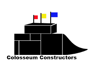
1. I chose to go with using individual blocks to form the logo for two reasons. First, I had difficulty creating a logo that would depict a 3D stadium. It would require too many layers and doing things that I have not learned yet. Second, the blocks represent the company's status as a construction company.
2. There is no deeper meaning behind the choice to use black as the main color. Bright colors don't make sense for a blue-collar business like construction. In addition, during the process to develop this logo, the logo became unappealing when I added as many colors as possible.
3. As for the flags, the three colors (red, yellow, and blue) are inspired by the three diamonds on the logo for the Pittsburgh Steelers. Accordingly, they represent the same thing as the diamonds, and that would be the materials required to create steel. Red represents iron ore. Yellow represents coal. Blue represents scrap steel. Steel is obviously a major component in any construction project.
4. The text "Colosseum Constructors" is purposefully designed to be as simple as possible. Again, this is a blue-collar industry. It is not glamorous. Cursive and/or fancy fonts would simply be out of place.
5. Similar to how I used simple objects to create the stadium, I chose to depict a high school like stadium because of its simplicity. Trying to design giant NFL stadiums proved too complex. In addition, I was concerned that the logo would be too busy and assault the eyes with detail. High school stadiums are also more relatable, as every community has one. Not every community has a big stadium.

No comments:
Post a Comment